
 Rick Nash scored two goals, two assists, and had a game high six shots on goal for the West all-stars as his team beat the East 12-9.
(Yes, 12-9. Welcome to the new NHL.)
Meanwhile, all fourteen people watching on Versus saw the mighty tandem of Ovechkin and Crosby score only one point between them. Not that we Nash fans enjoyed that or anything.
Hopefully, this will be a preview of things to come during the second half of the season. Making it to the playoffs is a dream that will (sigh!) have to wait for next season, but if Nash continues to develop at the rate he has been, holy cow will he be fun to watch.
The All-Star game also unveiled the new NHL uniforms, which are supposed to make the players faster, cooler, and safer. It certainly made them look slimmer.

Nash scores on Brodeur. Yes, his butt cheeks are hanging out, but at least his jersey and pants lines are in perfect alignment. Click to embiggenate.
I don’t suppose that I care that much one way or the other about the new unis. Sure looked to me like the players still used a lot of tape around their calves, but I wonder how much of that comes from old habits that will just die hard.
The interesting thing about the switch to me as a Jackets fan will be the league’s move to home whites, combined with the CBJ’s retiring of the original logo, and replacing it with the logo from the third jersey:
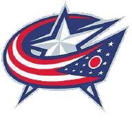
I never cared for the third-team jersey logo. I never cared much for the “C-J-B” logo either, but the new one isn’t that much better. Personally, I’d like to see the Blue Jacket theme brought more to the forefront, but I can understand why some would be nervous of offending Native Americans (although the Blackhawks haven’t avoided doing it.)
Am I the only one that thinks using the Ohio flag as the team’s icon is a bit tacky? I know some feel that “anything-red-white-and-blue-is-awesome-you-commie-scum!”, but to me, it just shows a lack of imagination, I guess. The Jackets were built from scratch, so it’d be nice to have iconography that reflects that and is completely unique, like some other teams have.
All-Star Game images credit & copyright: Getty Images

Not sure if you were aware, but the move to home whites isn’t set in stone yet. Also, the “Blue Jackets” name refers to the Union Army uniform, not the Native American of the same name. That’s why the patches have the soldier’s hat on them.
Thanks, Cory – the “Blue Jacket” moniker was originally meant to be a double entendre, though. It had a lot of meanings; it’s why it was such a good choice.
Yes, it’s a metaphor for Civil War soldiers, but also for the famous Indian who spent his life defending Ohio and who was responsible for ceding the Ohio Valley to the U.S.
The new logo is a Civil War themed logo, so between that and the civil war emblems on the shoulders it’s clear that the owners want to “push” that meaning. That’s fine, but I still think they could be more imaginative.